Habit Tracking with R Markdown, Google Sheets, and Cron
26 Feb 2017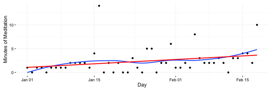
Who doesn’t want to form a few more good habits or get rid of a few bad ones? Last weekend, I wrote up some code to visualize how I’m doing on my habits. In this post, I’ll write briefly about my habit-tracking philosophy and then explain the simple program I wrote that visualizes my habits. You can see an example report here and check out my code on github here.
Habit Tracking
There are always things I want to improve about myself, whether it’s being a better researcher, becoming more politically active, or just wanting to be better at drawing birds. During my Ph.D., I’ve enjoyed the writing of Leo Babuata at Zen Habits, who advocates for building habits in a manner that is slow and steady. When it comes to creating or improving habits, I have a few general rules:
- Go slowly.
- Don’t stress.
- Keep track in a simple way.
With these principles in mind, each day I keep track of just three different things: Whether or not I exercised, what time I got out of bed, and how long I spent meditating. Every night before I go to sleep, I log them in a Google doc or Google Spreadsheet.
I try to keep whatever I’m logging simple: in the past, I would have recorded how far I ran and how long it took me. Now, when it comes to exercise, I just write down “run” and leave it at that. The important thing for me is that I got some exercise in, not that I’m improving my times by a few seconds every day. The focus on the minutia of improvement sucked the fun out of running for me, so now I try to just enjoy being outside and moving around.
Keeping track of habits in this manner might not be for everybody. Lots of friends are crazy about making “quantified self” tracking that is automated and silent, by using a Fitbit, for example. Personally, I like the routine of actively writing down something every day and not knowing exact details.
Visualizations
My friend recently sent my a Stephen Wolfram blog post titled “The Personal Analytics of My Life.”. Wolfram is best known for being the creator of Mathematica, a data analysis toolkit. His post includes a series of pretty cool visualizations of many years of data on Wolfram’s life. Inspired by this, I thought I’d create some graphs of my own on my much smaller dataset.
You can check out my work in this track_habits Github repo.
Below, I’ll talk about the design and go through a few sample code segments.
Design
As I mentioned, my habit-tracking data is stored in a Google spreadsheet.
I took two different shots at visualizing this data.
I wrote up an RMarkdown document to check out my progress.
RMarkdown is great: you write markdown and can intersperse code blocks which generate output in the form of graphs or text.
This makes it easy to create nice-looking reports that are simple to update if the underlying data changes.
I had originally planned to use an iPython Notebook, but since learning the R packages dplyr and ggplot2 a year and a half ago, I always find it difficult to go back to analyzing data in Python.
This time was no exception, despite my love for Python, but I do plan on finishing the iPython notebook version soon.
Sidenote: the easiest thing to do would be to make a bunch of graphs with Google’s built-in tools. Sheets has really cool automatic visualizations that I do recommend, especially for coding newbies. This project was a nice way for me to mess with new libraries and connect my programs to Google Sheets.
After creating the report, I decided I wanted it automatically generated and opened every week. Good old fashioned cron does just the trick for scheduling weekly jobs.
Connecting to Google Sheets
Connecting to Google Sheets was quite easy with the great googlesheets package.
The biggest hassle when pulling data from Google sheets is authentication.
googlesheets lets you authenticate by opening a website with a token in it that you copy into your application.
This works well in interactive sessions, but since my report is being generated automatically, I needed to store a token for later use.
This is easily accomplished with a few lines of code in setup_googlesheets.R:
# Instructions on keeping a local token cached here:
# https://cran.r-project.org/web/packages/googlesheets/vignettes/managing-auth-tokens.html#how-do-i-store-and-retrieve-a-token

library(googlesheets)

token <- gs_auth(cache = FALSE)
gd_token()
saveRDS(token, file = "googlesheets_token.rds")
Now that we have a token saved, pulling the Google sheets data into an R dataframe is easy:
# Get Google Sheet
gs_auth(token = "googlesheets_token.rds")
habits <- gs_title("Sample Habit Tracking")

# Get this year's data
data_2017 <- habits %>% gs_read(ws = "2017")
Data Cleaning
Next, I did a little bit of cleaning, changing empty cells to strings, converting strings to actual time objects, and making three dataframes for year, month, and week.
# Clean Exercise so it says "None" instead of being NA
data_2017[["Exercise"]][is.na(data_2017[["Exercise"]])] <- ""
data_2017 <- data_2017 %>% mutate(exercised = Exercise != "")

# Translate messier time (read as a string) to a Posix time
data_2017 <- data_2017 %>%
  mutate(wake_up = as.POSIXct(`Wake Up`, format = "%H:%M"))

# Make a few reusable dataframes for different timeframes
current_day <- Sys.Date()

df_ytd <- data_2017 %>% filter(Day < current_day)
df_month <- data_2017 %>% filter(Day >= current_day %m-% months(1),
                                 Day <  current_day)
df_week  <- data_2017 %>% filter(Day >= current_day %m-% weeks(1),
                                 Day <  current_day)
In the above, current_day %m-% months(1) comes from the lubridate package, and evaluates to a day one month ago.
%m-% is a subtraction operator for dates, and months(1) corresponds to one month.
The lubridate package lets you easily add or subtract units of time, such as months or weeks!
Example Graph: A Year of Meditation Times
I’ve found meditation to very beneficial for me. It’s helped me cope with the uncertainties and stresses that come from being a grad student, and I’ve found it helpful in other contexts: I think meditation helped me run a marathon without training for it, but that’s a story for another time!
I’d fallen off the wagon in terms of regularly meditating, so I decided to start with just a few minutes a day and gradually increase it every week. I made a plot along with two trendlines to see how I’m doing.
The plot:
The code that generated it:
ggplot(df_ytd, aes(x = Day, y=Meditate)) +
  geom_point() +
  geom_smooth(se=F) +
  geom_smooth(method = "lm", color="red", se=F) +
  scale_y_continuous("Minutes of Meditation") +
  theme_bw() +
  theme(rect = element_blank())
Breaking down what’s happening line by line…
- First we make a
ggplotobject with the dataframe that contains the whole year’s data. We map the Day column to the X axis and the Meditate column to the Y axis. geom_point()draws a point for each x-y pair, that is, each (day, minutes).geom_smooth(se=F)draws a smooth trendline. This can show “regional” dips if I’m lagging for some period of time. These=Foption removes a shaded standard error around the line.geom_smooth(method = "lm", color="red", se=F)makes a straight, linear trendline. This quickly answers the question “am I meditating more now that at the beginning of the year?” I made all the linear trend lines red in this project, and the smoothed ones blue. Visual consistency!scale_y_continuoussimply changes the Y axis label to “Minutes of Meditation”theme_bw() + theme(rect = element_blank())makes the theme more minimal.
Most of the other plots follow the same pattern as the above one.
Example Table: Exercise
exer_year_cnt <- df_ytd %>% count(Exercise) %>% rename(year = n)
exer_mnth_cnt <- df_month %>% count(Exercise) %>% rename(month = n)
exer_week_cnt <- df_week %>% count(Exercise) %>% rename(week = n)
exer_counts <- full_join(exer_year_cnt, exer_mnth_cnt)
exer_counts <- full_join(exer_counts, exer_week_cnt)
exer_counts[is.na(exer_counts)] <- 0

exer_counts %>% filter(Exercise != "") %>% pander
What I’m doing here is making three seperate dataframes of counts, where each row says a type of exercise and how many times I did it.
I join them all based on the exercise name.
The “full” join means you keep exercises that exist in one time unit but not in another.
For example, I did the 7 minute workout a lot at the beginning of the year (aka “7min”) but not later.
Full join keeps 7min as a row, but leaves the entry for number of times I did this last week as “null”.
We replace the nulls with 0 and print.
The pander at the end makes the table render well in HTML.
The output of this looks something like the following:
| Exercise | year | month | week |
|---|---|---|---|
| 7min | 4 | 0 | 0 |
| bike | 5 | 5 | 1 |
| run | 1 | 0 | 0 |
| ultimate | 9 | 5 | 2 |
| walk | 2 | 2 | 0 |
Automation
Finally, I automated this so it pops up every Sunday a bit before midnight.
A simple way of doing this is cron.
cron is a program available on most unix-like systems (including OSX) that allows you to specify a regular time that you want a program run.
You could specify things to be run daily, on a certain weekday, on the first of the month at 9:32pm, etc.
I won’t get into all of the specifics of cron here but I’ve used it in projects ranging from the personal to automating queries for the Clinton campaign.
cron runs programs in a different environment from your user environment.
Don’t worry if you don’t understand what that means– basically, your terminal (aka shell) knows where to find programs because you have a bunch of variables that tell it where to look.
These variables are different when cron is running a program.
There are probably better ways to do this but I just update this variable in a script, render the R Markdown document, then use the mac open command, which automatically opens the html file in chrome.
Here’s the script that cron will run:
PATH=  # TODO: copy and paste your $PATH here to make sure cron can find R and R libraries
cd {PUT HABIT TRACKING DIRECTORY HERE}
R -q -e 'rmarkdown::render("habits.Rmd")'
open habits.html
To get your PATH, type echo $PATH into the command line.
Below is what goes into cron.
Access it by running crontab -e and adding this line to the prompt that shows up.
59 23 * * sun {PUT HABIT TRACKING DIRECTORY HERE}/habits_cron.shThe first number is minutes and the second is hours.
59 and 23 mean it will run at the 59th minute of the 23rd hour, aka 11:59pm.
The third is day of month and fourth is month.
The stars mean that it will run for all of these: it doesn’t matter what day of the month it is or what month it is.
The last number (well, text here) says what day of the week.
The sun is short for Sunday, meaning this only runs on Sunday at 11:59pm.
Woo! That’s it.
Conclusion
A few thoughts in conclusion:
- I could have made all of this in Google Sheets with probably less effort and only a slightly uglier result. However, sometimes it’s nice to make something in a way that’s harder because (1) it helps keep your skills sharp, (2) you learn new things, and most of all, (3) it’s fun.
- I’d love to see improvements or answer questions. Please shoot me an email or send a pull request.
- I’ll try to finish up a python version. I really love python but whenever I start making visualizations I just get frustrated and switch to R!
Thanks for reading!